PaymentButton
Drop-in React component for Solana payments
PaymentButton
The PaymentButton component is a React component that provides a complete payment interface for accepting Solana payments. It handles wallet connection, token selection, transaction processing, and UI state management internally. Out of the box, it comes with customizable button and modals:
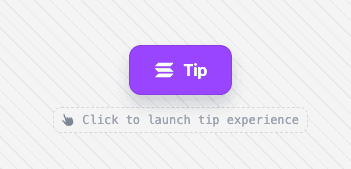
Tip Button
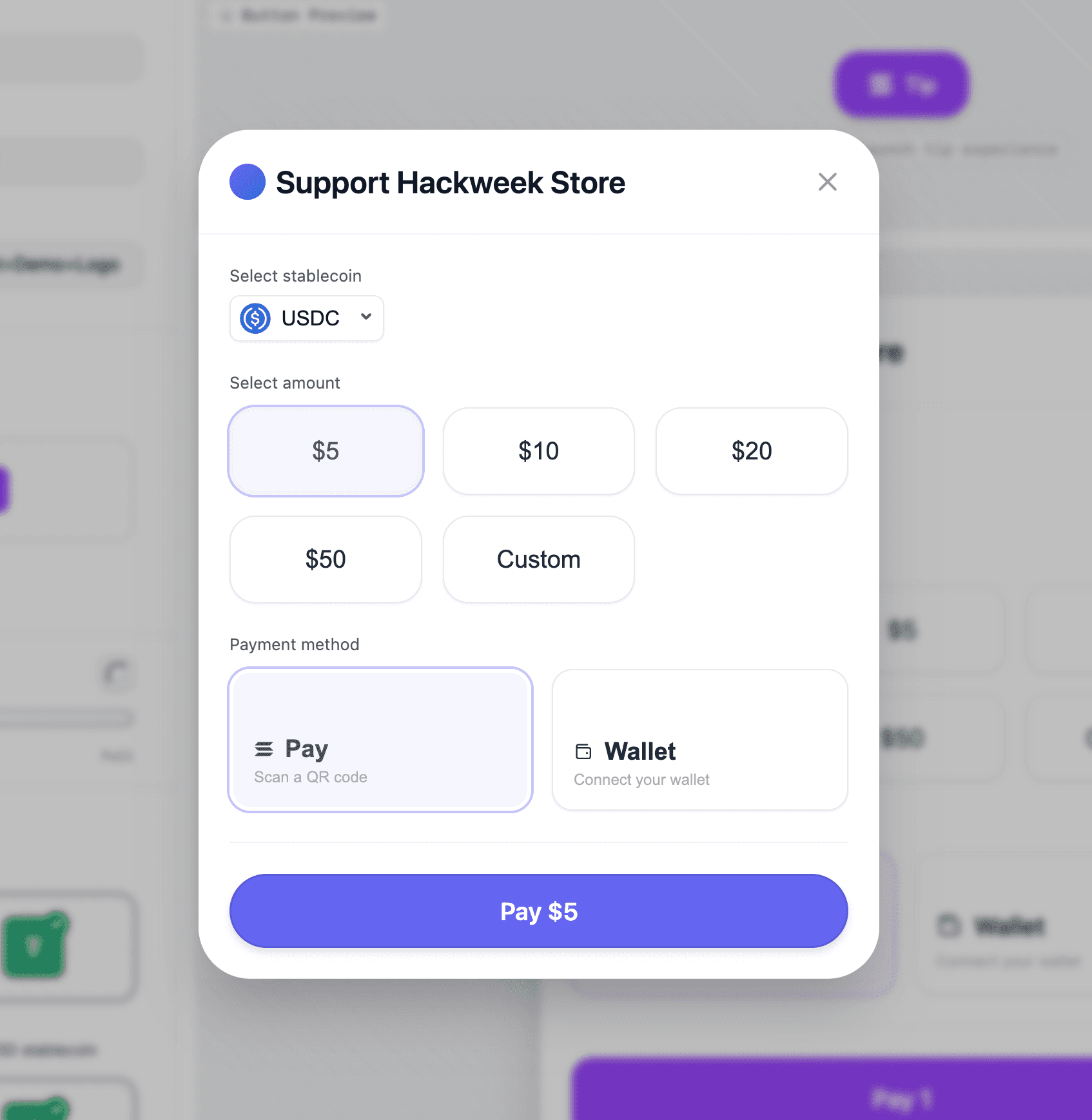
Pay Modal
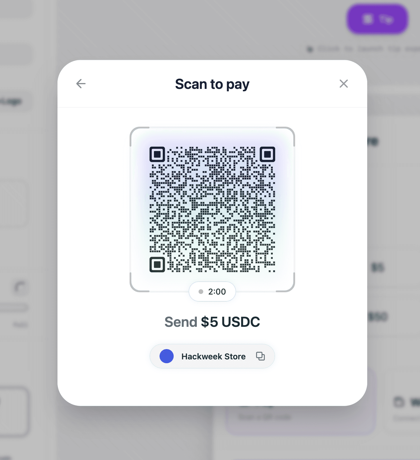
Solana Pay QR Code Modal
Installation
pnpm add @solana-commerce/kitComponent Props
PaymentButtonProps
The PaymentButton component accepts the following props:
Required Props
config(SolanaCommerceConfig) - Main configuration object for the payment component. This is the only required prop. See SolanaCommerceConfig below.
Optional Props
-
paymentConfig(PaymentConfig) - Payment-specific configuration including products, pricing overrides, and custom price fetchers. See PaymentConfig below. -
onPayment((amount: number, currency: string) => void) - Called when a payment is initiated after the user confirms the amount and currency. Receives the payment amount (in token units, not lamports) and currency identifier. -
onPaymentStart(() => void) - Called when the payment flow begins, before the actual transaction is submitted. Use this to show loading states or analytics tracking. -
onPaymentSuccess((signature: string) => void) - Called when the transaction is confirmed on-chain. Receives the transaction signature. This is where you should update order status, send confirmation emails, etc. -
onPaymentError((error: Error) => void) - Called when the payment fails at any stage (wallet connection, transaction submission, or confirmation). The error object contains details about what went wrong. -
onCancel(() => void) - Called when the user explicitly cancels the payment flow (closes the modal or clicks cancel). -
children(React.ReactNode) - Optional custom trigger element. If provided, replaces the default payment button. The child element should be clickable (e.g., a button). -
className(string) - CSS class name applied to the trigger button (only used when no custom children are provided). -
style(React.CSSProperties) - Inline styles applied to the trigger button (only used when no custom children are provided). -
variant('default' | 'icon-only') - Button variant. Default shows text and icon,'icon-only'shows only the payment icon.
Configuration Objects
SolanaCommerceConfig
The main configuration object passed to the config prop.
Required Fields
-
merchant(MerchantConfig) - Merchant information and payment recipient details. See MerchantConfig. -
mode('cart' | 'tip' | 'buyNow') - Payment mode that determines the button display text and UI flow:'buyNow'- Single product purchase with fixed amount'cart'- Shopping cart with multiple products'tip'- User chooses their own amount (donations/tips)
Optional Fields
-
position('inline' | 'overlay') - How the payment UI is displayed. Defaults to'overlay'.'overlay'- Opens in a modal/drawer overlay'inline'- Embedded directly in the page
-
theme(ThemeConfig) - Visual customization options. See ThemeConfig. -
network('mainnet' | 'devnet' | 'testnet') - Solana network to use. Defaults to'mainnet'. -
rpcUrl(string) - Custom RPC endpoint URL. If not provided, uses a default public endpoint for the selected network. -
allowedMints(string[]) - Array of token mint addresses to restrict payment methods. If not provided, all supported tokens (SOL, USDC, USDT) are available. -
showQR(boolean) - Whether to show QR code payment option. Useful for mobile and Solana Pay integration. -
enableWalletConnect(boolean) - Whether to enable wallet connection. Set tofalseif you're handling wallet connection externally. -
showMerchantInfo(boolean) - Whether to display merchant name and logo in the payment UI. -
debug(boolean) - Enables verbose console logging for debugging.
MerchantConfig
Defines the payment recipient and business information.
Required Fields
-
name(string) - Business or merchant name displayed to users during checkout. -
wallet(string) - Solana wallet address that will receive payments. Must be a valid base58-encoded Solana address.
Optional Fields
-
logo(string) - URL to merchant logo image. Displayed in the payment UI whenshowMerchantInfois enabled. -
description(string) - Business description shown to users.
ThemeConfig
Visual customization for the payment UI.
All fields are optional and have sensible defaults.
-
primaryColor(string) - Primary brand color used for buttons and accents. Default:'#9945FF'(Solana purple). -
secondaryColor(string) - Secondary accent color. Default:'#14F195'(Solana green). -
backgroundColor(string) - Modal/container background color. Default:'#ffffff'. -
textColor(string) - Primary text color. Default:'#111827'. -
borderRadius('none' | 'sm' | 'md' | 'lg' | 'xl' | 'full') - Border radius applied to UI elements. Default:'lg'.'none'= 0px'sm'= 12px'md'= 16px'lg'= 20px'xl'= 24px'full'= Fully rounded (context-dependent)
-
fontFamily(string) - Font family for all text. Default:'system-ui, -apple-system, sans-serif'. -
buttonShadow('none' | 'sm' | 'md' | 'lg' | 'xl') - Drop shadow for buttons. Default:'md'. -
buttonBorder('none' | 'black-10') - Border style for buttons. Default:'black-10'(subtle black border).
PaymentConfig
Advanced payment configuration for pricing, decimals, and products.
All fields are optional.
-
products(Product[]) - Array of products for'cart'or'buyNow'modes. Required when using these modes. Each product has:id(string, required) - Unique product identifiername(string, required) - Product name displayed to userquantity(number, required) - Quantity of this productprice(number, optional) - Price per unit in USDunitAmount(number, optional) - Alternative topricefielddescription(string, optional) - Product description
-
solPriceUsd(number) - Fixed SOL price in USD. Use this for testing or when you want to lock the SOL price. If not provided, the component fetches the current price from CoinGecko. -
getSolPrice(() => Promise<number>) - Custom function for fetching SOL price. Use this for:- Private price oracles
- Avoiding public API rate limits
- Custom pricing logic
- Enterprise applications
If not provided, defaults to CoinGecko public API with 1-minute caching.
-
tokenDecimals({ [currency: string]: number }) - Override token decimal precision. Useful for custom tokens. Example:tokenDecimals: { 'CUSTOM': 8, 'USDC': 6 // Can override defaults } -
fallbackSolPriceUsd(number) - Fallback SOL price if the price API fails and no cache is available. Without this, the payment UI will show an error if price fetching fails.
Internal Hooks
The PaymentButton component uses several internal hooks to manage state and compute values:
useTheme(theme?: ThemeConfig)
Merges user-provided theme config with default theme values. Returns a complete ThemeConfig object with all fields populated.
Default theme values:
primaryColor: '#9945FF'secondaryColor: '#14F195'backgroundColor: '#ffffff'textColor: '#111827'borderRadius: 'lg'fontFamily: 'system-ui, -apple-system, sans-serif'buttonShadow: 'md'buttonBorder: 'black-10'
The hook is memoized and only recomputes when the theme config changes.
useTotalAmount(mode, paymentConfig?)
Calculates the total payment amount based on the commerce mode and products.
Behavior by mode:
'tip'mode - Returns0(amount is user-determined)'cart'and'buyNow'modes - Sums upprice * quantityfor all products inpaymentConfig.products
The hook handles edge cases:
- Missing or invalid prices default to
0 - Missing or invalid quantities default to
0 - Ensures all values are finite numbers
- Supports both
priceandunitAmountproduct fields
Returns the total amount as a number (in USD for cart/buyNow, 0 for tip).
usePaymentUrl(merchant, amount, mode)
Generates a Solana Pay URL for the payment. This URL can be encoded as a QR code for mobile wallet scanning.
Returns: A solana: protocol URL with query parameters for:
recipient- Merchant wallet addressamount- Payment amountreference- Unique payment reference (generated from timestamp + random string)label- Merchant name (sanitized for URL safety)message- Contextual message based on mode
Returns an empty string if the merchant wallet is invalid or amount is <= 0.
Security: The merchant name is sanitized using sanitizeString() to prevent XSS attacks through URL injection.
Validation & Error Handling
The component performs validation before rendering:
-
Wallet Validation - Uses
isAddress()fromgillto validate the merchant wallet address. If invalid, renders an error state instead of the payment UI. -
Pricing Validation - Ensures valid pricing is configured:
- For
'tip'mode: Always valid (user chooses amount) - For
'cart'and'buyNow'modes: Validates thattotalAmount > 0
- For
-
SSR Safety - Uses client-side detection to prevent hydration mismatches. The
isClientstate ensures browser-only features (likelocalStoragefor wallet persistence) only run on the client.
Component Architecture
The PaymentButton wraps all children in two context providers:
-
AppProvider- Provides wallet connection state and connector client- Auto-connect: disabled by default
- Storage: Uses
localStoragewhen available (client-side only) - Debug mode: configurable via config
-
ArcProvider- Provides Solana blockchain client and RPC connection- Network: Determined from
config.network - RPC URL: Uses server-side resolution with fallback to public endpoints
- Network: Determined from
RPC URL Resolution
The component includes sophisticated RPC URL resolution:
- If
config.rpcUrlis provided, it's used directly - Otherwise, it calls a server-side resolver that selects reliable endpoints
- Falls back to
https://api.mainnet-beta.solana.comif resolution fails - Resolution happens asynchronously on mount and updates state
Rendering Modes
Overlay mode (position: 'overlay' or default):
- Renders a trigger button (custom or default)
- Opens payment UI in a responsive modal (desktop) or drawer (mobile)
- Uses
ResponsiveShellcomponent for adaptive layouts
Inline mode (position: 'inline'):
- Embeds payment UI directly in the page
- No trigger button needed
- Useful for dedicated checkout pages
Both modes use SecureIframeShell internally to render the payment interface in a sandboxed iframe for security.
Usage Examples
Basic Payment
<PaymentButton
    config={{
        merchant: {
            name: 'Coffee Shop',
            wallet: 'your-wallet-address'
        },
        mode: 'buyNow'
    }}
    paymentConfig={{
        products: [{
            id: 'coffee-001',
            name: 'Espresso',
            price: 4.50,
            quantity: 1
        }]
    }}
    onPaymentSuccess={(sig) => {
        console.log('Payment confirmed:', sig);
    }}
/>
Tip Widget with Custom Price Fetcher
<PaymentButton
    config={{
        merchant: {
            name: 'Content Creator',
            wallet: 'creator-wallet'
        },
        mode: 'tip'
    }}
    paymentConfig={{
        // Use your own price API to avoid rate limits
        getSolPrice: async () => {
            const res = await fetch('/custom-api/solana-price');
            const data = await res.json();
            return data.price;
        },
        // Fallback if your API fails
        fallbackSolPriceUsd: 200
    }}
/>
Shopping Cart with Custom Theme
<PaymentButton
  config={{
    merchant: {
      name: 'My Store',
      wallet: 'store-wallet',
      logo: '/logo.png'
    },
    mode: 'cart',
    theme: {
      primaryColor: '#FF6B6B',
      backgroundColor: '#1a1a1a',
      textColor: '#ffffff',
      borderRadius: 'xl',
      buttonShadow: 'lg'
    },
    showMerchantInfo: true
  }}
  paymentConfig={{
    products: [
      { id: '1', name: 'T-Shirt', price: 25, quantity: 2 },
      { id: '2', name: 'Hoodie', price: 45, quantity: 1 }
    ]
  }}
  onPaymentSuccess={(signature) => {
    // Verify transaction on your backend
    fetch('/api/verify-payment', {
      method: 'POST',
      body: JSON.stringify({ signature })
    });
  }}
/>
Custom Trigger Button
<PaymentButton
    config={{
        merchant: { name: 'Shop', wallet: 'address' },
        mode: 'buyNow'
    }}
    paymentConfig={{
        products: [{ id: '1', name: 'Product', price: 10, quantity: 1 }]
    }}
>
    <button className="custom-button">
        🚀 Pay with Solana
    </button>
</PaymentButton>